ALLTRAILS REDESIGN
Description:
This project was made for a high-level User Interface Design and Evaluation course. Throughout the process, I employed research methods, design principles, and designing for future development as I come from a development background.
Role:
User Researcher/Product Designer
Timeline:
April 2022 – July 2022
Tools:
Figma/Sketch, Google Forms, Google Sheets.
Process Overview

01 Overview
Alltrails is a popular app that allows users to find hiking trails nearby and explore the outdoors. We were tasked to collect, analyze, evaluate, and apply user data to make our app look and function as the user expects. The image to the right is the actual app*

02 Tools
- Figma
- Marvel App
- Google Forms
- Google Docs
- Adobe Illustrator


03 Interviews and user personas
Our team conducted studies using techniques such as card sorting, surveys, and A/B tests. You can see the data by clicking the image on the right. We created user personas including the one listed to the right. This helped us summarize our findings from the linked study.

04 Gathering data
Marvel app/Ballpark
One of my favorite ways of getting data from the user is using a website called Marvel App. This makes it easy to gather data from the user that is relatively unbiased as it tracks things like the number of clicks, time spent, etc. This makes A/B testing easy as it does not require a person to say which design they prefer (which is important in and of itself) but instead gives more objective metrics that lead to a more efficient and delightful user experience. Linked in the picture is a simple example study that tracks number of clicks the user makes for a certain task.

Surveys
Surveys are incredibly useful at the beginning to get data on who your users are and what their interests are, whether or not they like certain features, and what their needs are. Surveys do not get in-depth enough to be the sole method of gathering data though as users often answer survey questions quickly with little thought. For the Alltrails redesign, we used surveys frequently to gather data on user sentiment.

A/b testing
I use Marvel App to conduct A/B tests because it offers concrete data on which designs are easier to interact with for users. I can collect data on things like time, number of clicks, where their mouse is moving, etc. This helps get an unbiased idea of which parts of the design work and which parts do not. This is how we came up with the top filters as we wanted them to be visible as studies with filters behind a menu showed they were hard for users to understand.

05 Mockups
We started creating mockups to then test with our selected users. This allowed us to get better data on what works and what does not.
06 Get More data
After our first design iterations, we conducted studies using Marvelapp and Google Forms which helped us understand exactly what we could change and improve on. A link to that data can be seen by clicking the image to the right.

07 Iterate again
We made slight modifications to our app and tested them again with users. See the data for yourself by clicking the image to the right! We found that younger users wanted a better way to compete and have incentives which led us to create a "leaderboard" screen that you will see below.

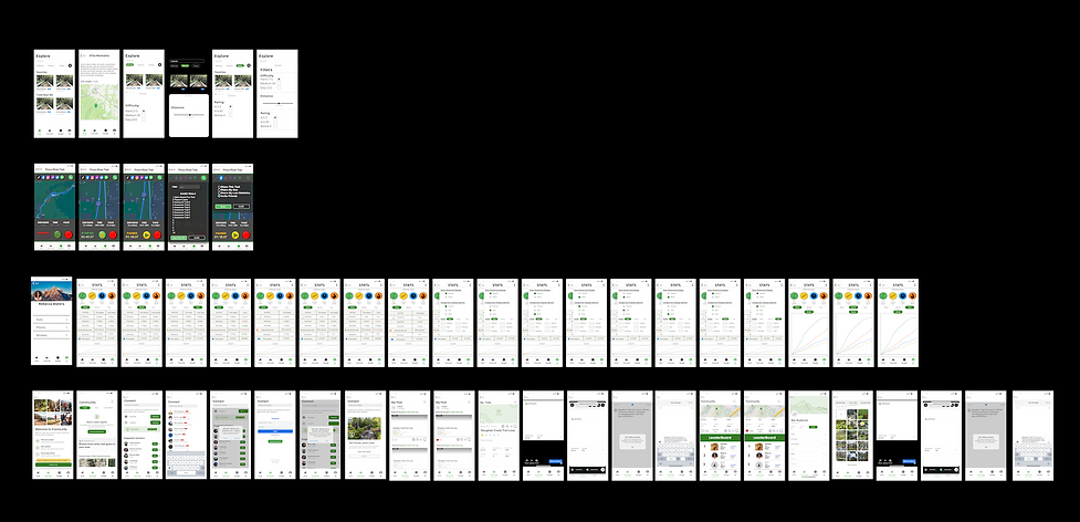
08 Solution
The image below is a sample of the solution we created. Among other things, we found that the majority of users did not use many of the included features and actually found them to get in the way of features that they want to use. This led us to create a stripped-down version of the app that emphasized important features. Overall, this project was less about the end design and more about the process of collecting and analyzing user needs.

09 Next steps
One of the skills that I am working on cultivating is designing everything with development in mind. This stems from my background as a software engineering student which has helped me focus on time-saving and feasible designs that help developers save time and resources. In this example, efforts were made to make the Navbar familiar to developers. This helps keep the app relatively simple to design. Further, the general design uses a lot of grid layouts which are easy to implement in SwiftUI using HStacks and VStacks. This could also be accomplished using GridLayout with XML.
Closing thoughts
The redesign of the AllTrails app aimed to improve the user experience for people looking to find new trails. To achieve this, our team conducted research and found that people wanted a more engaging and gamified experience.
Based on this insight, the new AllTrails app features leaderboards, allowing users to compete with each other and track their progress. This gamified aspect of the app adds a new level of motivation and excitement for users, encouraging them to continue exploring new trails and becoming more active in the outdoor community.
In addition to the leaderboards, the redesign of the app also focused on reducing clutter and simplifying the user interface. This makes it easier for users to find the information they need and quickly plan their next outdoor adventure. The new design prioritizes a more visually appealing and intuitive experience, allowing users to focus on what really matters: finding the best trails for their next hike.
Finally, the redesign also introduced a more social element to the app, allowing users to connect with each other, share their experiences, and exchange tips and advice. This creates a sense of community, encouraging users to engage with each other and share their love of the outdoors. With these new features, the AllTrails app has become an even more valuable resource for people looking to explore new trails and experience the great outdoors.